
Now that the first-day data from my “Dual-wielding on the right wrist & migrating to iPhone 15” setup has been collected, I can’t stop grinning while staring at my Excel sheet! This time, I’m going to do a hardcore comparison review on the “differences in sleep graphs between the two models,” which yielded some incredibly fascinating results! ✨
The app screens look different, and the screenshots don’t line up perfectly, making it a bit tricky to view, but I’ve lined up their unique graphs in order below. 👇
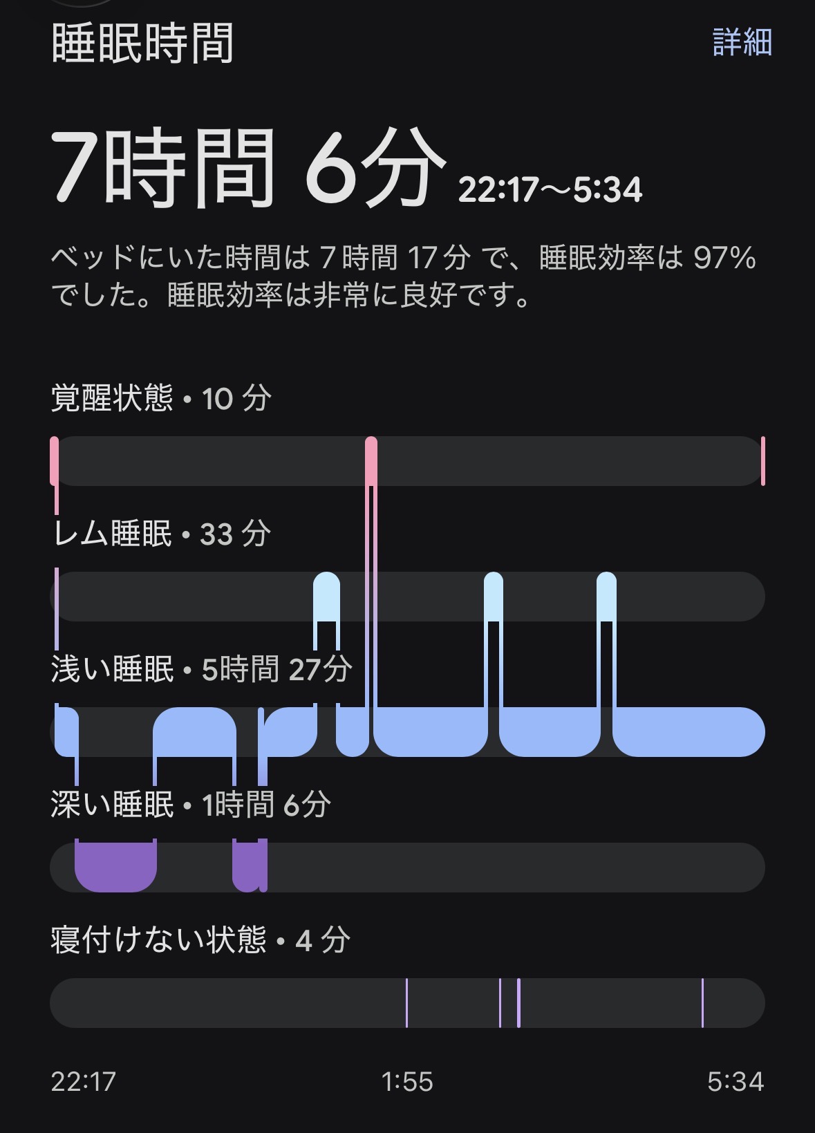
▼ Fitbit Air (Screenshot of the Dark Screen)
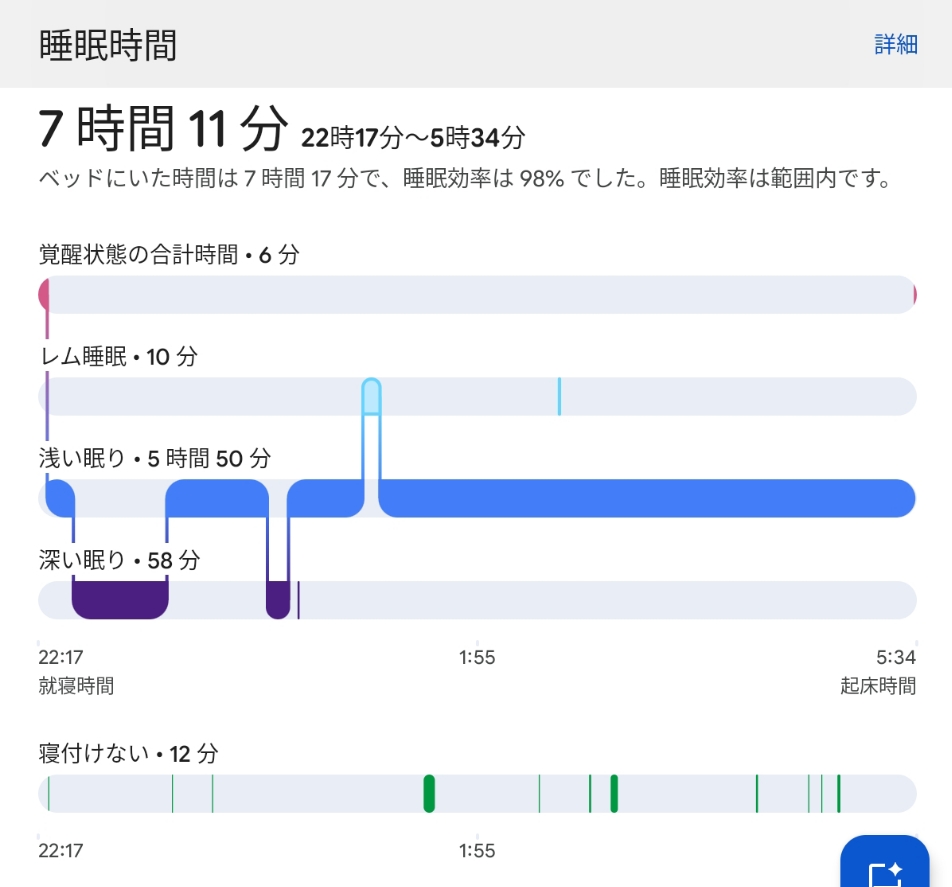
▼ Fitbit Charge6 (Screenshot of the Light Screen)
- 😲 Sleep/Wake Times Are Almost Identical! Astonished by the In-Bed Detection
- 🚨 The 1:30 AM Bathroom Trip: The Air Didn’t Miss It!
- 🧐 A Huge Discrepancy in REM Sleep Detection Too!
- 🤝 Conclusion: Life Logging is Fun Precisely Because They Differ!
- ✍️ Afterword: What Exactly is the “Raison d’Être” of a Tracker?
😲 Sleep/Wake Times Are Almost Identical! Astonished by the In-Bed Detection
First, looking at the very top of the graphs, what blew me away was the exact time I got into bed and the time I woke up in the morning.
Believe it or not, both devices recorded Sleep at “22:17” and Wake at “5:34”, matching up perfectly!!! 🚀✨
(The total sleep time was 7 hours 6 minutes for the Air, and 7 hours 11 minutes for the Charge 6—a mere 5-minute difference!)
As expected from sister models sharing the same DNA. Wearing them side-by-side on my right wrist to sleep was totally worth it. The accuracy of detecting my sleep onset and wake timing is absolutely flawless on both!
🚨 The 1:30 AM Bathroom Trip: The Air Didn’t Miss It!
Since the times matched perfectly, I wondered, “Is the data inside completely identical too?” But taking a closer look at the wave patterns of the graphs, the “individuality of each device” clearly stood out.
The truth is, I woke up around 1:30 AM, actually got out of bed, and went to the bathroom. 🚶♀️💨
When comparing that exact moment on both devices…
- Fitbit Air (Dark Screen): Around 1:30 AM (just before 1:55), the pink “Awake” line pops up beautifully, and the sleep graph below it cuts out into a clean blank space! Brilliant! 🎯
- Fitbit Charge6 (Light Screen): Unbelievably, it failed to capture that clear moment of movement as “Pink (Awake).” Instead, it either glossed over it as light sleep or counted it at the very bottom as restlessness.
Capturing actual behavior realistically and a bit strictly, the newcomer—Fitbit Air—takes a massive victory here!
🧐 A Huge Discrepancy in REM Sleep Detection Too!
I stumbled upon another critical difference: the total duration of “REM sleep,” which is the light sleep state where dreaming occurs.
- Fitbit Air (Dark Screen): Successfully detected a solid “33 minutes”! Towards the latter half of the graph, you can see three beautiful light-blue bumpy peaks occurring.
- Fitbit Charge6 (Light Screen): Shockingly, it only detected “a mere 10 minutes” of REM sleep…! On the graph, there’s only one tiny peak visible.
The newcomer, Air (Dark Screen), seems to be way ahead of the veteran Charge 6 (Light Screen) in tracking things like midnight bathroom trips and REM sleep with “extreme detail and realism”!
And yet, for some reason, the Air shows “No Score”… Did the app-side score calculation experience a time lag? (Haha) 😂
Meanwhile, the Charge 6 gave me a Sleep Score of “82” and a Readiness Score of “53”!
🤝 Conclusion: Life Logging is Fun Precisely Because They Differ!
Even though they are wrapped around the same wrist and measuring the rhythm of the same heart, the Air is ultra-sensitive, catching mid-night bathroom breaks and REM sleep flawlessly, while the veteran Charge 6 takes a more laid-back approach.
As I’ve said before, demanding a tracker’s numbers to be “100% correct” is missing the point.
Lining up the “differences” and reading the story of “changes” produced by these two unique personalities is precisely the absolute best part of being a gadget guinea pig. 😊💖
✍️ Afterword: What Exactly is the “Raison d’Être” of a Tracker?
Before kicking off this experiment, I came across some chilly comments online saying, “What’s the point of wrapping a wrist-only tracker around your ankle? Isn’t it just an accessory?” (* ̄▽ ̄)
All the while, I was thinking to myself, “That’s exactly why I’m testing it out in dead earnest to see what happens!”
When it comes to data from smartwatches and activity trackers, it’s completely normal for step counts to run high or heart rates to fluctuate depending on the manufacturer’s algorithm and sensor characteristics. These are not medical alert devices. Competing over “which number is absolutely correct” compared to another model is pretty meaningless in my opinion. (If you genuinely need that level of accuracy, go use medical-grade testing equipment! Haha!)
To me, the purpose of a tracker isn’t absolute numerical correctness, but rather observing “how things are changing” compared to my past self.
“Did I walk more compared to last month?”
“How is my sleep score shifting compared to last week?”
Tracking the daily “changes” of a single human being under the exact same conditions is where the true joy of life logging lies, and it’s the proper way to use these gadgets. 😊✨
That’s why observing how data glitches out in a bizarre environment like an ankle is a perfectly legitimate data verification project!
And to pinpoint the underlying cause of that glitch, I threw myself into the next battlefront: “Dual-wielding on the right wrist.”
Because it’s an experiment nobody else is doing, there are insights to be found.
I’d be thrilled if you keep enjoying and following along with this gritty road movie of a gadget guinea pig! Don’t let the fierce summer heat beat you, and look forward to the next round of dual-wielding measurement data!!! 🐯🔥🔥📱💻🚀🍏✨

コメント Leave a Comment