In our previous guide, we walked through the fundamentals of creating a custom WordPress navigation menu and displaying it in both your desktop header and mobile slide-in menu.
In this tutorial, we will take that navigation structure a step further. You will learn how to build a clean category hierarchy (parent and sub-items), display it in your sidebar, style it elegantly using Cocoon’s built-in Font Awesome 5 icons, and add a practical accordion toggle script that keeps your sidebar neat and readable.
- Why Use WordPress Menus for Sidebar Categories Instead of Default Widgets?
- Step-by-Step Guide to Creating a Hierarchical Category Menu in WordPress
- Adding the Navigation Menu Widget to Your Sidebar
- Styling the Sidebar Category Menu with Font Awesome 5 and Custom CSS
- Creating an Accordion Dropdown for WordPress Parent Categories
- Conclusion
Why Use WordPress Menus for Sidebar Categories Instead of Default Widgets?
You might wonder: “Why not simply use the default Categories widget?” While the built-in widget works, utilizing the WordPress Menu feature to showcase your categories provides significant architectural benefits for your website.
Here are the three primary advantages of organizing categories through a custom menu:
- Complete Control Over Display Order: Default category widgets sort items alphabetically or by post count. With a custom menu, you can place your most important, high-converting categories right at the very top.
- Curate and Highlight Specific Topics: You can easily exclude categories that are still in draft or have few posts, focusing the visitor’s attention strictly on your cornerstone content.
- Seamlessly Blend Internal and External Links: By utilizing “Custom Links,” you can smoothly insert links to sub-sites (such as a translated directory or companion blog), special landing pages, or key tag archives directly into the exact same sidebar list.
While adding new categories to a menu requires a quick manual update, this hands-on approach gives small business websites and niche blogs total control over user pathways and site structure.
Step-by-Step Guide to Creating a Hierarchical Category Menu in WordPress
Let’s start by building a hierarchical category structure using the WordPress drag-and-drop interface.
Create a New Menu Structure
First, create a dedicated menu space specifically for your sidebar.
- In your WordPress dashboard, navigate to Appearance ➔ Menus.
- Click the link that says create a new menu.
- Enter an easily identifiable name in the Menu Name field (e.g., Sidebar Categories).
- Click the Create Menu button.
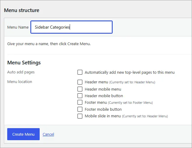
*Note: This menu name is strictly for internal management within your dashboard, so choose whatever title makes sense to you.
Add Categories to Your Custom Menu
Once your menu structure is established, add the categories you want to display.
- On the left panel, click the Categories accordion to expand it.
- Switch to the View All tab.
- Check the boxes next to the categories you want to feature.
- Click the Add to Menu button.
Your selected categories will now appear in the Menu Structure area on the right.
Drag and Drop to Set Parent and Sub-Category Relationships
You can effortlessly reorder items and create parent-child relationships using simple drag-and-drop actions.
- Click and hold the block of the item you want to turn into a sub-item.
- Drag it directly underneath its intended parent item, then slide it slightly to the right before releasing your mouse.
- The item will indent to the right and display a sub item label, confirming the hierarchy.
- Once your order and parent-child levels look right, click the Save Menu button at the bottom of the screen.
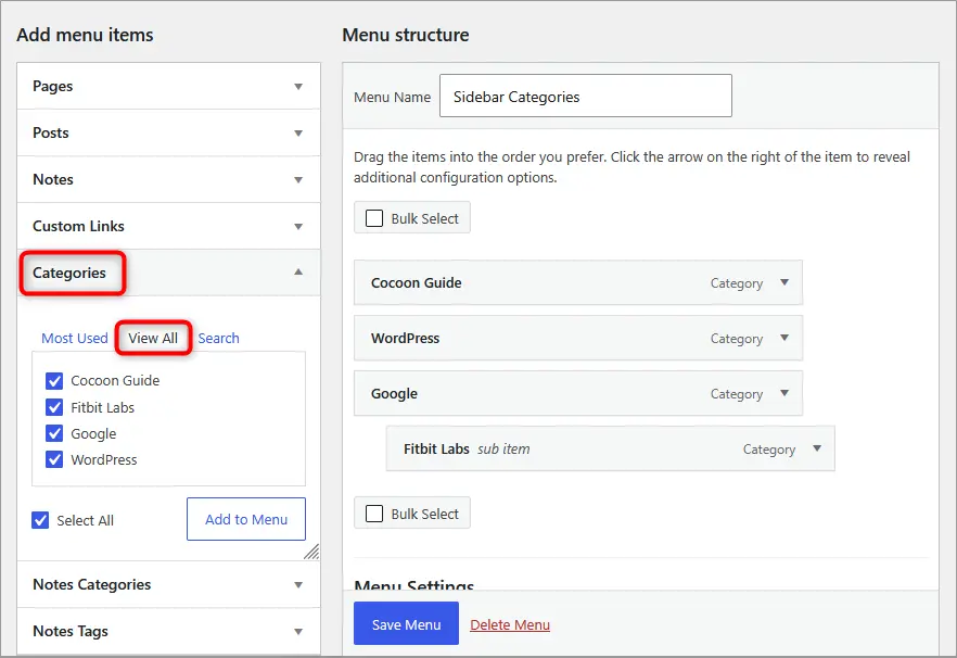
Indenting items beneath a parent gives your navigation a clean, logical nested structure that visitors can follow instinctively.
Adding the Navigation Menu Widget to Your Sidebar
Now that your category hierarchy is ready, let’s display it in your site’s sidebar area.
- Go to Appearance ➔ Widgets in your WordPress dashboard.
- Locate the Navigation Menu widget in the available widgets list.
- Drag and drop it into your Sidebar widget area (or select “Sidebar” and click “Add Widget”).
- Expand the widget settings and type your preferred heading (such as Categories) into the Title field.
- Under Select Menu, choose your newly created Sidebar Categories menu.
- Click Save.
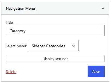
Your custom category menu is now live and functional in your sidebar!
Styling the Sidebar Category Menu with Font Awesome 5 and Custom CSS
While the default list works fine, plain text links can look a bit uninspiring. By combining Cocoon’s native Font Awesome 5 icon library with a few lines of clean CSS, we can transform it into an elegant, polished navigation element.
We will add an open folder icon to top-level parent categories, a neat horizontal ellipsis icon to indented sub-items, and subtle border dividers between rows.
Custom CSS for Cocoon Child Theme
Paste the following styling into Appearance ➔ Theme File Editor ➔ Stylesheet (style.css):
-
/* -------------------------------------------
 * Sidebar Navigation Menu (Category) Styling
 * ------------------------------------------- */

/* Reset list padding/margins and add divider lines */
.sidebar .widget_nav_menu ul {
  margin: 0;
  padding: 0;
  list-style: none;
}

.sidebar .widget_nav_menu li {
  border-bottom: 1px solid #eeeeee;
  position: relative;
  line-height: 1.6;
}

.sidebar .widget_nav_menu li a {
  display: block;
  padding: 8px 36px 8px 4px; /* Reserve space on the right for toggle button */
  color: #333333;
  text-decoration: none;
  transition: color 0.2s ease, background-color 0.2s ease;
}

/* Link hover styling */
.sidebar .widget_nav_menu li a:hover {
  color: #2055a4;
  background-color: #f9f9f9;
}

/* Parent menu icon (Folder icon) */
.sidebar .widget_nav_menu ul.menu > li > a::before {
  font-family: "Font Awesome 5 Free";
  content: "\f07c"; /* Open folder */
  font-weight: 900;
  margin-right: 8px;
  color: #d9534f; /* Accent color - customize as needed */
}

/* Indent and initially hide sub-menus */
.sidebar .widget_nav_menu .sub-menu {
  margin-left: 12px;
  border-top: 1px solid #eeeeee;
  display: none; /* Collapsed by default */
}

.sidebar .widget_nav_menu .sub-menu li:last-child {
  border-bottom: none;
}

.sidebar .widget_nav_menu .sub-menu li a {
  padding-right: 4px; /* Restore standard right padding for sub-items */
}

/* Sub-menu item icon (Horizontal ellipsis) */
.sidebar .widget_nav_menu .sub-menu li a::before {
  font-family: "Font Awesome 5 Free";
  content: "\f141"; /* Horizontal ellipsis */
  font-weight: 900;
  margin-right: 8px;
  color: #d9534f; /* Accent color - customize as needed */
  font-size: 0.85em;
}

/* -------------------------------------------
 * Accordion Toggle Button Styling
 * ------------------------------------------- */
.sidebar .widget_nav_menu .menu-toggle-btn {
  position: absolute;
  top: 0;
  right: 0;
  width: 38px;
  height: 38px;
  background: transparent;
  border: none;
  cursor: pointer;
  display: flex;
  align-items: center;
  justify-content: center;
  color: #888888;
  padding: 0;
}

.sidebar .widget_nav_menu .menu-toggle-btn::before {
  font-family: "Font Awesome 5 Free";
  content: "\f078"; /* Downward chevron (closed state) */
  font-weight: 900;
  font-size: 0.8em;
  transition: transform 0.25s ease;
}

/* Open state (Rotate chevron upward) */
.sidebar .widget_nav_menu li.is-open > .menu-toggle-btn::before {
  transform: rotate(180deg);
  color: #2055a4;
}
Creating an Accordion Dropdown for WordPress Parent Categories
As your blog grows, a long list of sub-categories can make your sidebar look cluttered. To solve this, we can set up an intuitive accordion: clicking the parent category text takes the user directly to that category’s archive page, while clicking the arrow icon on the right smoothly toggles the sub-menu open and shut.
Here is what the responsive accordion looks like in action:
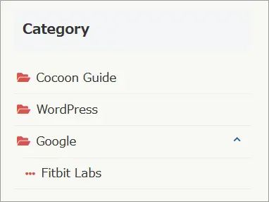
No heavy plugins are needed—just a lightweight, vanilla script added directly to your Cocoon Child theme’s javascript.js file.
Adding the Accordion Script to javascript.js
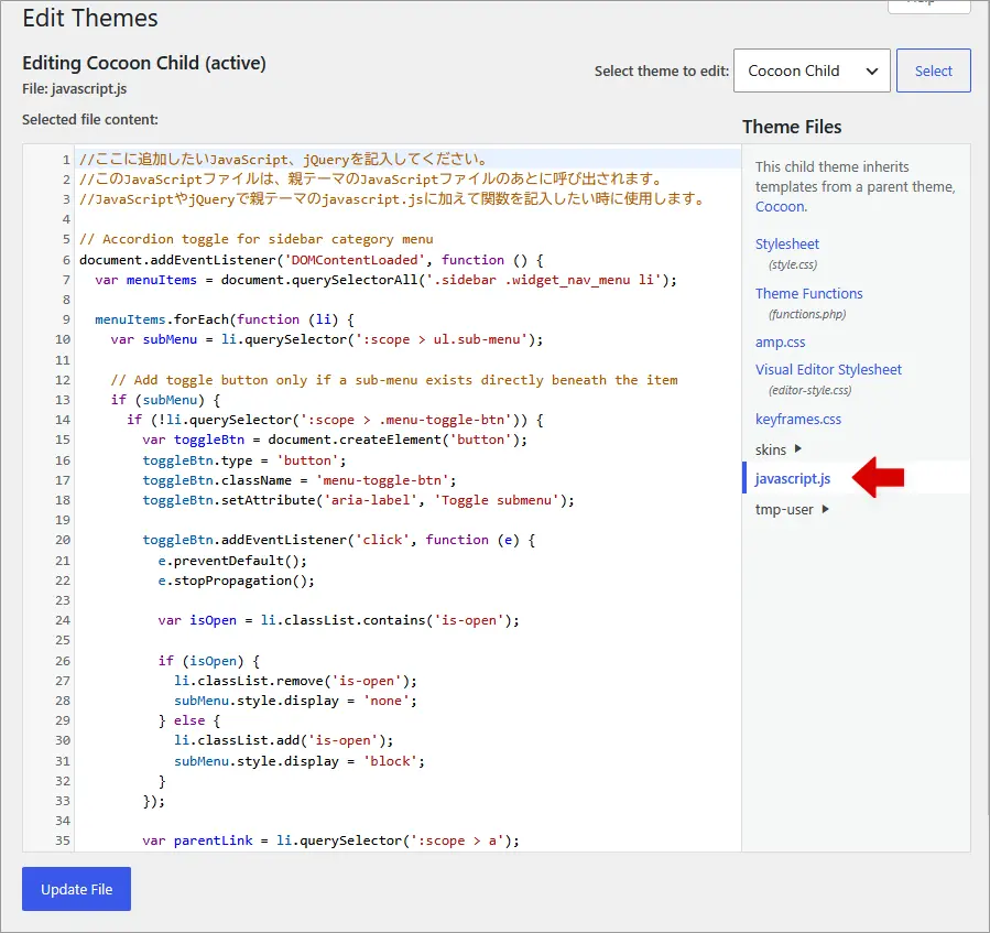
- In your WordPress dashboard, go to Appearance ➔ Theme File Editor.
- Verify that Cocoon Child is selected in the Select theme to edit dropdown at the top right.
- In the right-hand theme files list, click on javascript.js.
- Copy the JavaScript code below and paste it at the bottom of the file.
- Click Update File.
-
// Sidebar category menu accordion toggle
document.addEventListener('DOMContentLoaded', function () {
  var menuItems = document.querySelectorAll('.sidebar .widget_nav_menu li');

  menuItems.forEach(function (li) {
    var subMenu = li.querySelector(':scope > ul.sub-menu');

    // Attach toggle button only if a sub-menu exists directly underneath
    if (subMenu) {
      if (!li.querySelector(':scope > .menu-toggle-btn')) {
        var toggleBtn = document.createElement('button');
        toggleBtn.type = 'button';
        toggleBtn.className = 'menu-toggle-btn';
        toggleBtn.setAttribute('aria-label', 'Toggle sub-menu');

        toggleBtn.addEventListener('click', function (e) {
          e.preventDefault();
          e.stopPropagation();

          var isOpen = li.classList.contains('is-open');

          if (isOpen) {
            li.classList.remove('is-open');
            subMenu.style.display = 'none';
          } else {
            li.classList.add('is-open');
            subMenu.style.display = 'block';
          }
        });

        var parentLink = li.querySelector(':scope > a');
        if (parentLink) {
          parentLink.after(toggleBtn);
        } else {
          li.appendChild(toggleBtn);
        }
      }
    }
  });
});
Once saved, clear your browser cache (hard refresh) and check your sidebar. The category text functions normally as a link to your posts, while the right-hand chevron toggle expands and collapses sub-categories seamlessly.
Conclusion
Leveraging the WordPress Menu feature to organize your sidebar categories gives you complete control over your site’s hierarchy, presentation, and user journey. Coupled with lightweight CSS styling and a pure JavaScript accordion toggle, your sidebar stays clean, organized, and inviting.
A well-structured sidebar significantly enhances visitor navigation and keeps readers exploring your content longer. Give it a try on your site and create an organized sidebar experience your readers will love!

Comments